Case Studies: Chapter 9 – Mobile App
How the Mobile App Product team at a European retail group increased sales by half a million per month
Whatever challenge Product teams may have with managing their Web channel, that challenge is tenfold on their Apps. Apps are a no-joke, legitimate software development project that requires brands to be as good at development as any full-time software company. Even when the App’s development may often be outsourced to a specialist, any enhancements or redesigns then come with a relatively higher contractor price tag for the brand. That puts even more pressure on roadmap prioritization.
Additionally, enhancements of apps require much more time to develop and release than the web channel. Not only does the new version of the app have to be quality tested by the brand before rollout, but it has to be reviewed and accepted by the app stores as well. Users of the app then have to download the newest version before they benefit. On native apps, you’ve got separate code bases for iOS vs. Android, i.e., your work is doubled.
As a result, every benefit we’ve covered for Experience Analytics is also a multifold benefit for the Product teams managing Apps. Let’s see a case study here for roadmap prioritization, i.e., focusing your resources where they will bear the most fruit.
The Challenge
The retailers app worked fine, and their sales conversion rate was okay. But what “low-hanging fruit” enhancements would be most likely to improve sales further?
Step 1: Use Journey Analysis to identify bottlenecks
As on the Web, Journey Analysis is a great starting point to review where, within the flow, customers tend to abandon. Which journeys are leading to success vs. abandonment?
In the case of this App, Journey Analysis showed a lot of interactions with the Product List Pages (PLP) and a relatively significant drop-off from there, i.e., fewer app users were accessing a Product Display Page (PDP). So, the PLP jumped out as an area to look into.
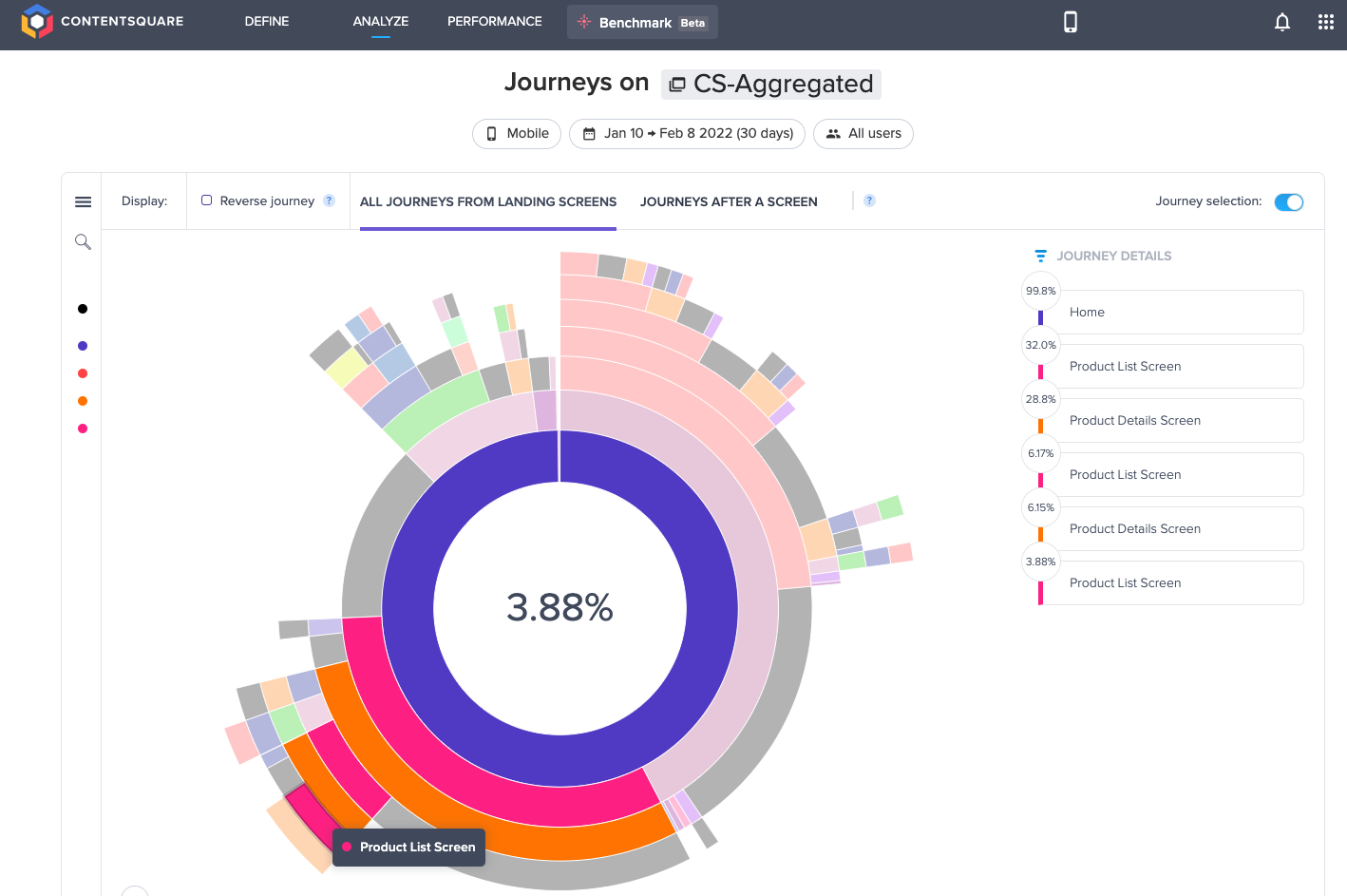
Image: Journey Analysis example for a mobile App
Step 2: Use In-Page Analysis to answer why some users abandon
Since the Product team’s question was about improving the micro-conversion rate from their PLP onward to PDPs, the go-to visualization for in-page behavioral insights is a Zone-based Heatmap. Head-diving into session replays already at this point would give some color to what’s going on. But it’s much more effective and efficient to first look at behaviors in aggregate before drilling deeper.
So, the Product team started comparing tap rates and conversion rates for content on their PLP.
Definition: Tap Rate
The percentage of users on a given app screen that taps on the content zone at least once
Definition: Conversion Rate per Tap: Of users that tapped on a zone, the percentage that also completed a given journey
The Product team found that relatively few users were engaging with the sub-navigation elements, “Categories’ and “Refine,” for filtering the products on the PLP. These two zones had a relatively low tap rate, even though these buttons were at the top of the screen and visible to everyone.
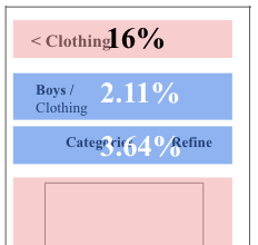
Illustration: Low tap rate on the sub-navigation
However, the Product team also found that the sub-navigation had a relatively higher conversion rate, i.e., users who did interact with these buttons were more likely to complete their journey and make a purchase.
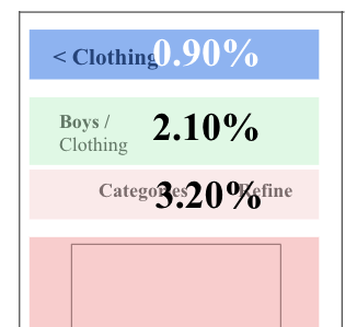
Illustration: High conversion rate per tap on the sub-navigation
So the insight is that an improvement that helps more users take advantage of these filters is likely to improve experience and sales. But by how much? Is it worth the effort?
Step 3: Impact quantification for the potential value
By comparing the difference in conversion rates between those that did v.s. did not take advantage of the sub-navigation, the Product team calculated a high potential revenue gain from addressing the opportunity. So they decided to invest.
Step 4: Hypothesis and designing the enhancement
Based on the findings, the Product team hypothesized that the experience could be improved by including top-performing categories and options to “sort” and “refine” search results. This would enable users to filter with a single tap.
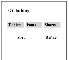
Illustration: App PLP test variation informed by customer behavior
Step 4: A/B test and value achieved
The A/B test was very successful. Interaction with top categories increased by 52%, even though interaction with the “refine” button declined further. In addition, the order conversion rate from the PLP increased by 3.07%, leading to half a million in additional sales per month.
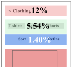
Illustration: Why did the A/B test win? Zone-based heatmap shows engagement with the top categories increased.
The moral of the story
This story shows an almost ideal analysis flow where the team zoomed in from macro-level insights down to the micro-level.
-
Start with a birds-eye view, i.e., Journey Analysis to find issues and opportunities.
-
Descend onto the target with in-page analytics to understand why the behavior is happening, i.e., in this case, Zone-based heatmaps.
-
Whenever needed, go down to the ground level by watching relevant session replays to get an anecdotal understanding of user behavior and experiences.
-
Prioritize whether to invest based on impact quantification.
-
Design and test the enhancement reap the benefits.
This flow is probably the most typical to memorize for innovation purposes, i.e., macro to micro. In contrast, the flow often goes in the reverse direction for troubleshooting issues, i.e., start from one customer’s challenge, e.g., the session where a customer left feedback via Voice of Customer. Then zoom out to see how many others experienced the same frustrations.