Spiders vs. Bars for Maturity Models
Sharp, as always, Jacques Warren commented on my previous post why maturity model people always gravitate to Spider graphs?
Wouldn’t it be easier to read bar charts?
Worth a try!
So, belowe are the three examples from the digital marketing maturity model as bar charts instead of spider diagrams.
Which to prefer, Spider or Bars?
Comparing to the spider charts from the previous post, I’d say Jacques is right on. The Spider charts look more sophisticated and interesting. But the bar charts are much easier to read.
Graph masters
Dress your charts to impress. That may sometimes mean making them look fancy, but usually probably means making them meaningful and easy to interpret.
There is nothing that “sells” analytics like good visuals.
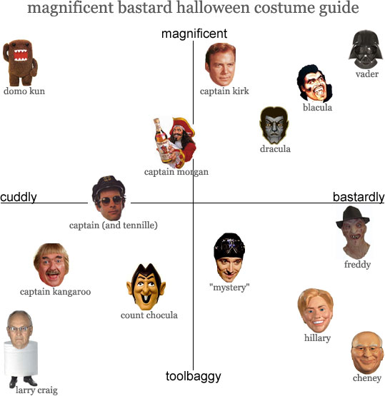
To that point, some people are just so genius that I feel hopelessly behind to their masterminds. Case in point, see for example the following Halloween costume chart by “MB“.
Happy Halloween!


I would even suggest that vertical columns offer a more dramatic view of what’s done and needs to be done. You can also spare the “Room for Growth” part of the bar, since it would be easily seen as “blank”, but I don’t object it, really; it does bring the reader’s attention more agressively to what is lacking.
Finally, since I’m at it, loose the third dimension (the shadow effects); it doesn’t add any information and makes the graph a little more difficult to read (the values don’t seem to be quite on the marks).
Hi Jacques,
Those recommendations ring a bell. Thank you again.
I sense that the ideal representations for “gap charts” hasn’t been found yet.
Akin